

Pop Art: British vs. American
The Origins of Pop Art
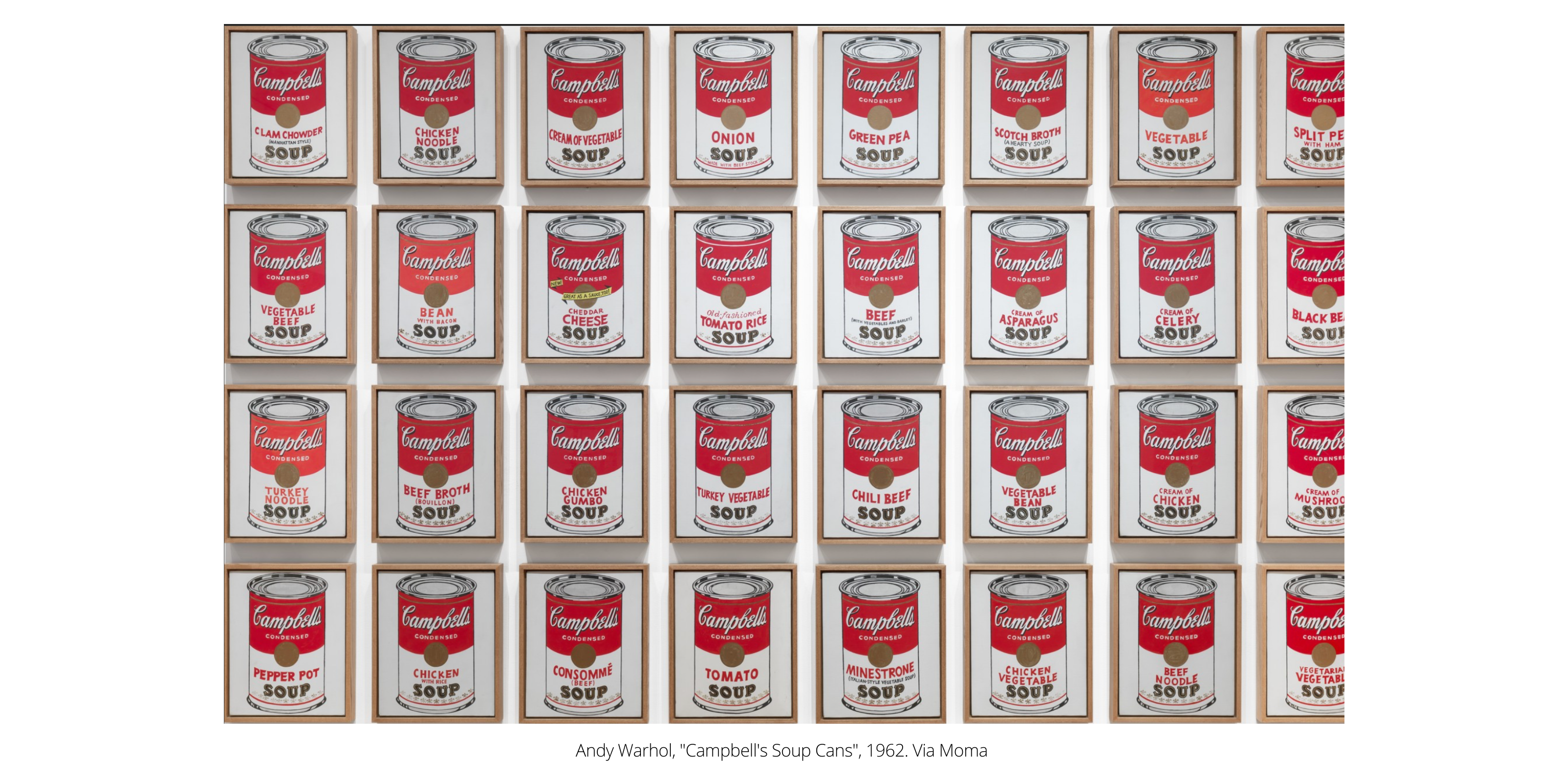
Pop Art emerged as a dynamic art movement in the late 1950s and reached its peak during the 1960s, a period marked by rapid economic expansion and cultural shifts as the world recovered from World War II (1939 – 1945). This post-war boom, characterized by increased consumerism, mass production, and the rise of advertising, became a key source of inspiration for the founding artists of Pop Art. These artists, including figures like Andy Warhol and Roy Lichtenstein, used everyday objects—Warhol’s Campbell’s Soup Cans being a quintessential example—to create clever critiques on the nature of mass production and consumer culture. By elevating mundane items to the status of fine art, they highlighted the pervasive influence of capitalism and its cyclical nature of ‘boom and bust’. Pop Art thus emerged as both a celebration and a critique of the post-war economic landscape, questioning the values of a society increasingly driven by consumption.
The roots of Pop Art can also be traced back to earlier art movements, particularly Dadaism, which emerged in the 1920s as a reaction against traditional art and societal norms. Dadaism, with its anti-establishment ethos, laid the groundwork for the disruptive aesthetics that Pop Art would later embrace. For instance, Marcel Duchamp, a French Dadaist artist, famously used a ‘readymade’ object—a common urinal—to create his groundbreaking artwork Fountain (1917). This work challenged the very definition of art, pushing the boundaries of what could be considered a valid artistic expression. Duchamp’s concept of using ordinary, everyday objects to provoke thought and critique societal norms directly influenced the Pop Art movement. While Pop Art diverged from Dadaism in its embrace of popular culture, the underlying concept of elevating everyday objects to the status of fine art remained constant, serving as a vehicle for engaging the public in important social commentary. This blending of the mundane with the profound is what gives Pop Art its enduring relevance and appeal.
British & American: Key Aesthetic Characteristics and Differences
Before delving into the differences between British and American Pop Art, it’s worth considering what generally comes to mind when one thinks of Pop Art. Typically, bright colours, iconic imagery from popular culture, and a sense of humor or irony are what define this movement. Richard Hamilton, often considered the father of British Pop Art, encapsulated the essence of the movement when he described it as “popular, transient, expendable, low-cost, mass-produced, young, witty, sexy, gimmicky, glamorous and big business.” This description underscores the movement’s connection to the contemporary world, emphasising its accessibility and relevance to the masses.
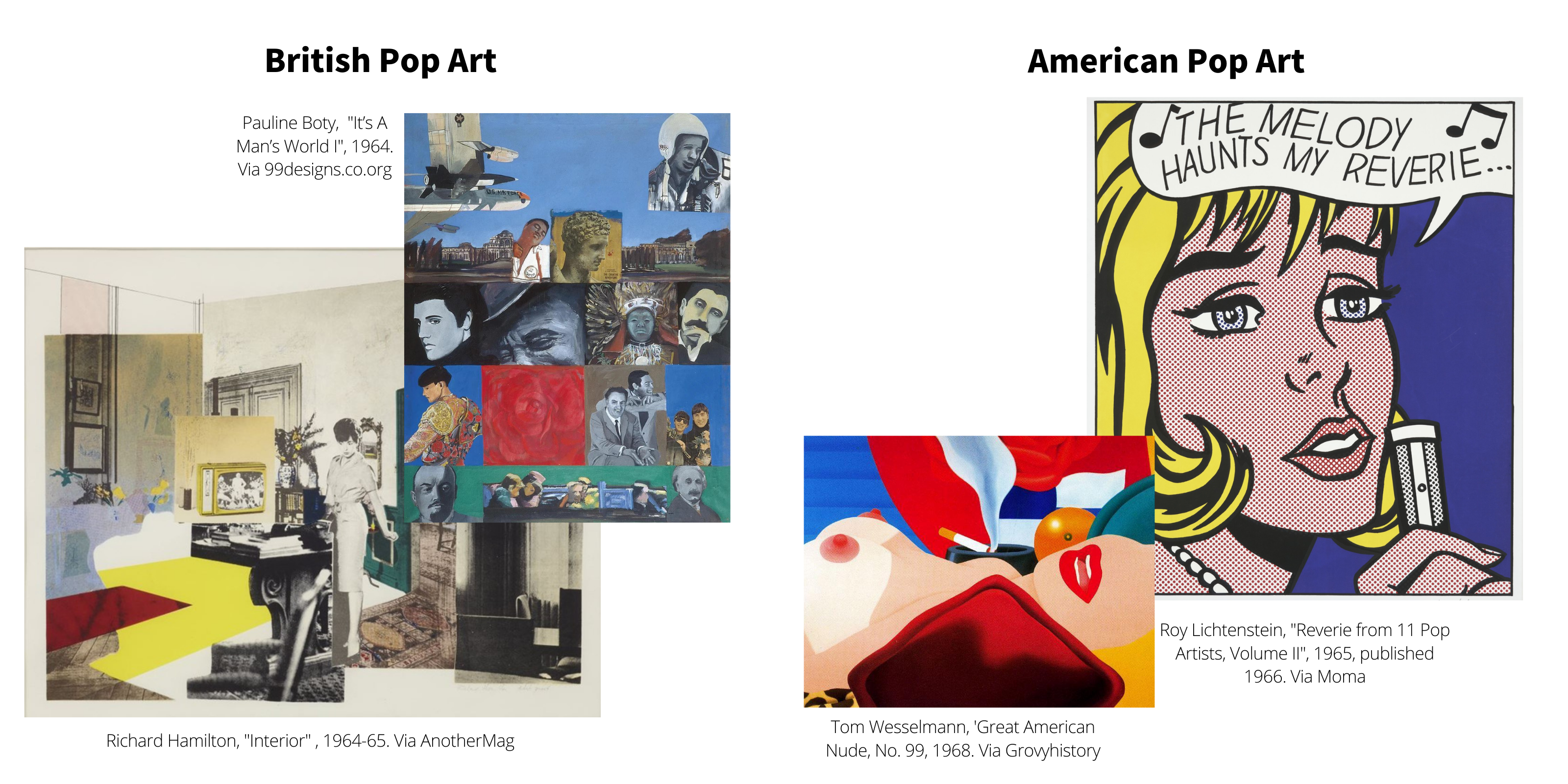
Although British and American Pop Art shared core values, their aesthetics and thematic focuses diverged significantly. British Pop Art was heavily influenced by American pop culture as it was perceived and interpreted from across the Atlantic, creating a unique perspective that was both fascinated and critical of American consumerism. In contrast, American Pop Art was a direct response to the ‘American Dream’ narrative, reflecting the artists’ firsthand experiences of a society steeped in consumerism and mass media. This difference in perspective led to distinct aesthetic approaches. American Pop Art often carried a sense of irony and detachment, as artists like Andy Warhol highlighted the dissonance between the idealised ‘dream’ and the often stark reality of everyday life in America. Warhol’s iconic works, such as Campbell’s Soup Cans (1962) and Marilyn Monroe (1967), exemplify this critique, using repetition and familiar imagery to comment on the superficial nature of consumer culture and the commodification of celebrity.
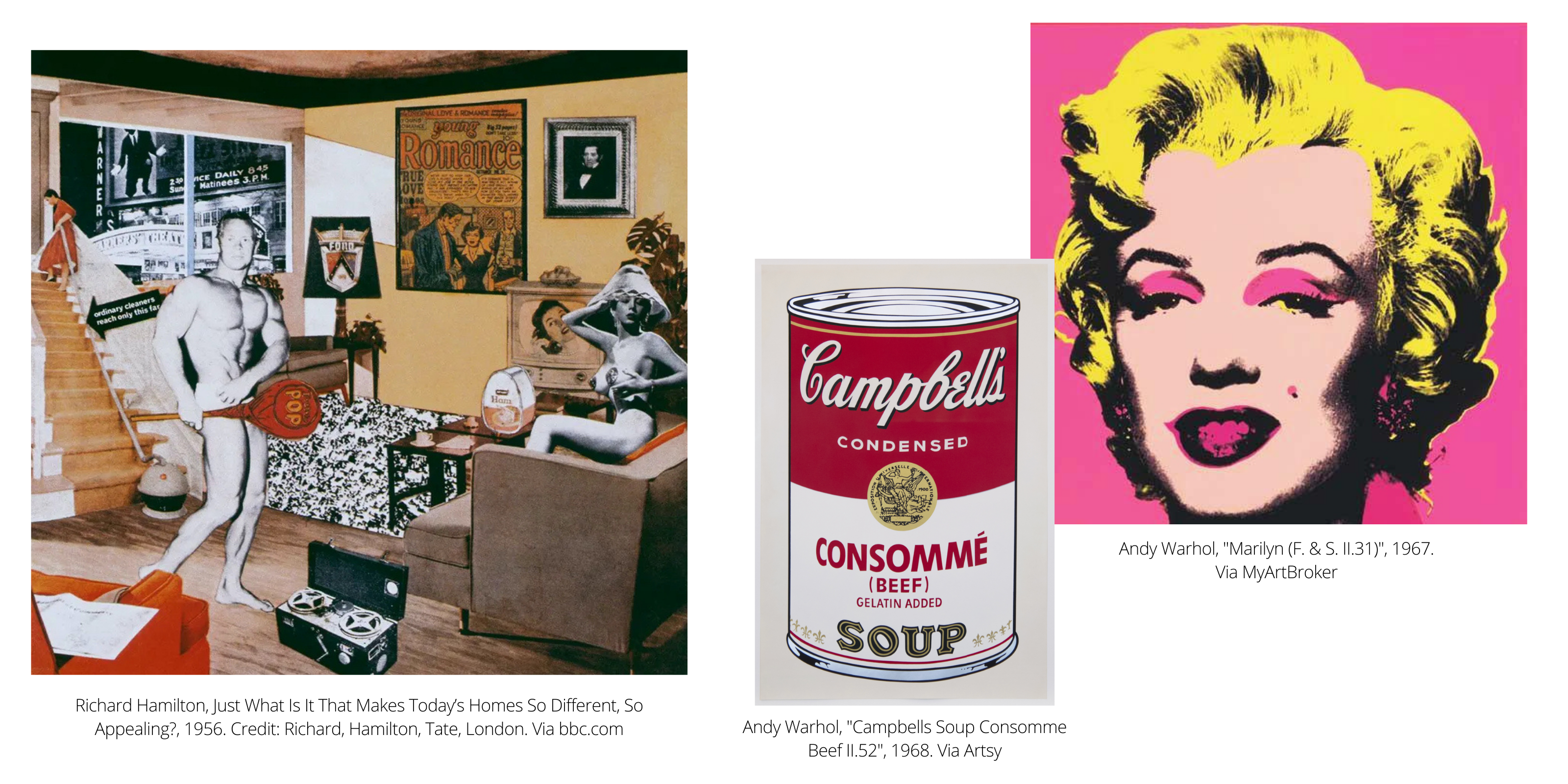
Across the Atlantic, British pop artist Richard Hamilton responded to similar themes but with a different approach. In his work Just What Is It That Makes Today’s Homes So Different, So Appealing? (1956), Hamilton used real cuttings from American illustrated magazines to create a collage that directly mocked the consumer culture of the ‘American Dream’. The juxtaposition of objects like a television, a vacuum cleaner, a tin of ham, and the Ford Motor Company crest in a domestic setting highlighted the absurdity and materialism that were becoming increasingly prevalent. This work serves as a critique not only of American culture but also of the creeping influence of these values on British society, illustrating how Pop Art served as a transatlantic dialogue on the effects of mass consumption and its broader social implications.
British Pop Art
Contrary to common belief, Pop Art actually emerged in Britain during the mid-1950s before gaining traction in America. The movement began with The Independent Group, a collective founded in London in 1952, which included artists such as Richard Hamilton, Eduardo Paolozzi, and Nigel Henderson. These individuals, along with other members like Lawrence Alloway, Reyner Banham, and Alison and Peter Smithson, were united by their disapproval of traditional ‘high art’ and its elitist culture. They sought to create art that was accessible, relevant, and reflective of the rapidly changing post-war world. The Independent Group’s meetings, held at the Institute of Contemporary Arts (ICA), were a breeding ground for ideas that would shape the future of British art, where discussions on mass media, technology, and popular culture played a crucial role in shaping the aesthetic and conceptual framework of Pop Art.
Richard Hamilton, often referred to as ‘The Father of the Pop Art movement,’ played a pivotal role in defining the direction of British Pop Art. His work was characterized by a keen interest in the relationship between consumer culture and visual representation. In his iconic collage Just What Is It That Makes Today’s Homes So Different, So Appealing? (1956), Hamilton combined images from American magazines to create a satirical commentary on the materialism and consumerism that were becoming increasingly dominant in post-war Britain. The collage features a bodybuilder holding a giant lollipop with the word “POP” inscribed on it, surrounded by various consumer goods like a television, a vacuum cleaner, and a canned ham. This work not only critiqued the growing obsession with consumer culture but also highlighted the influence of American popular culture on British society, which was still recovering from the austerity of the war years.
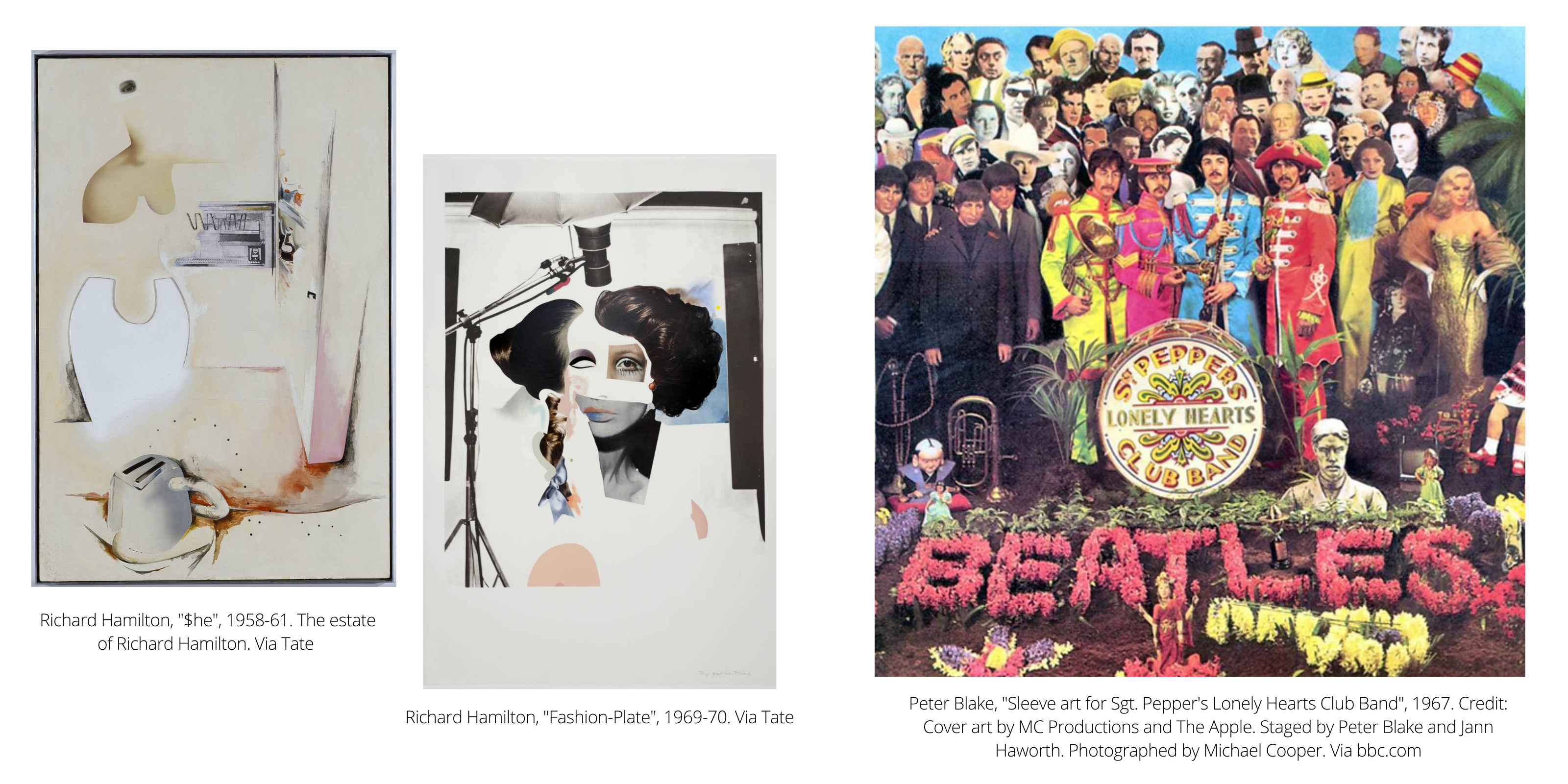
Hamilton’s prodigy, Blake, then went on to be most famous for designing one of the most iconic images of British Pop Art in the 1960s – the album cover of The Beatles’ Sgt. Pepper’s Lonely Hearts Club Band (1967). Alongside this, Blake also produced several interesting collage-based paintings that included magazine images, postcards, or mass-produced objects.
Eduardo Paolozzi, another key figure in British Pop Art, brought a distinct approach to the movement with his fascination for technology, science fiction, and the mechanization of modern life. Paolozzi’s early works, such as his 1947 print I Was a Rich Man’s Plaything, are considered precursors to Pop Art. This piece, part of his BUNK series, incorporated imagery from American magazines, including a pin-up girl, a Coca-Cola advertisement, and a fighter plane, layered together to critique and celebrate the rise of American consumerism and its impact on post-war Europe. Paolozzi’s work was deeply influenced by his experiences during the war and the subsequent flood of American culture into Britain, which he observed with both fascination and skepticism. His sculptural works, like The Head of Invention (1955), also reflect this preoccupation with the intersection of technology and humanity, blending mechanical forms with organic shapes to create a commentary on the post-war technological boom.
Nigel Henderson, another prominent member of The Independent Group, contributed to British Pop Art through his innovative use of photography and collage. Henderson’s works often explored the gritty realities of urban life in post-war Britain, capturing the changing landscape of East London with a raw, documentary style. His series of photographs and collages, such as Screen (1956), merged images of everyday life with abstract patterns, reflecting the influence of mass media and advertising on the public consciousness. Henderson’s approach to Pop Art was more introspective and socially engaged than his American counterparts, offering a critical perspective on the rapid modernization and commercialization of British society.
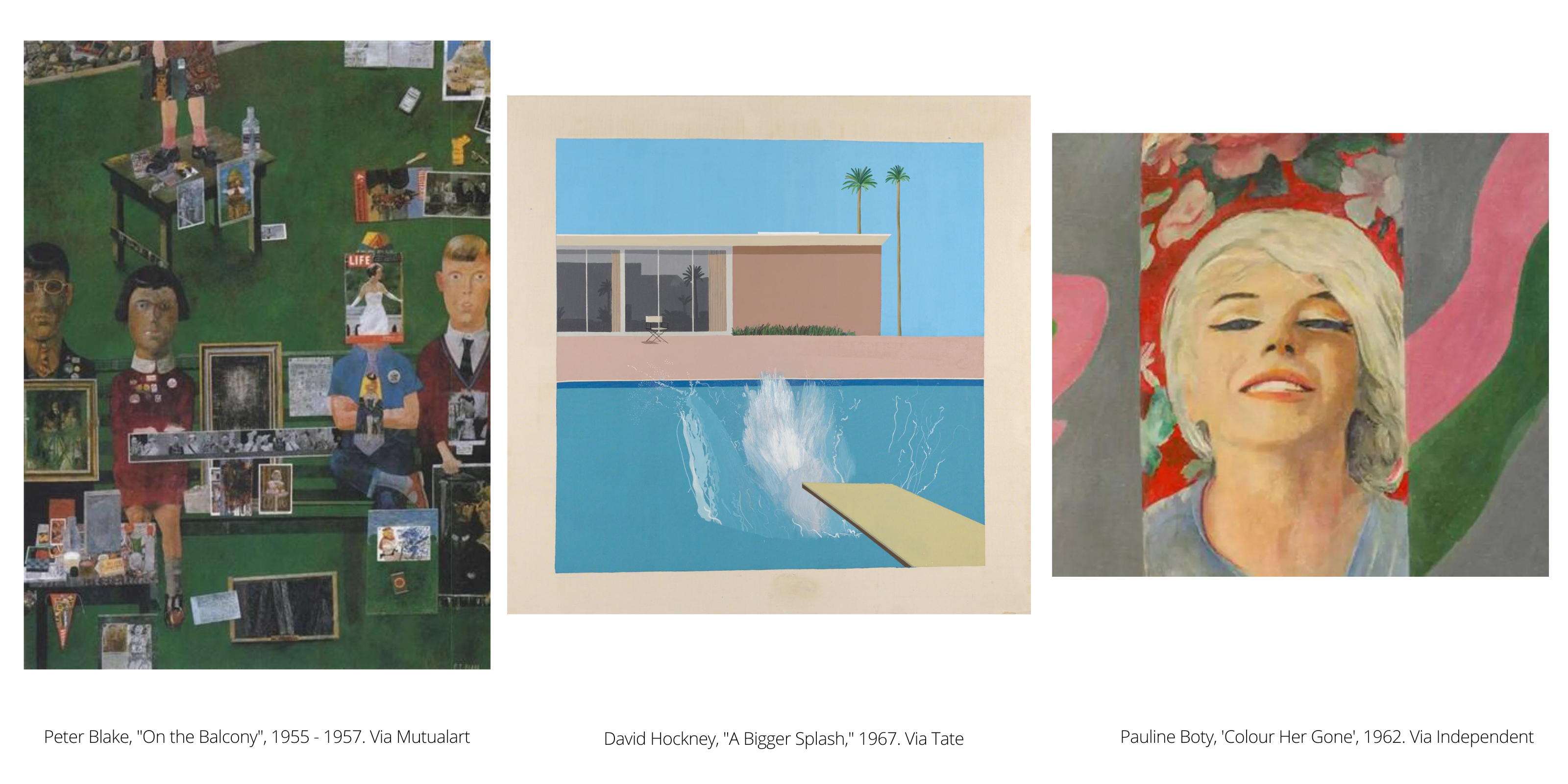
During this period, Hamilton also taught at the Royal College of Art in London, where he mentored the second generation of British Pop artists, including Pauline Boty, David Hockney, and Peter Blake. These younger artists brought their own unique perspectives to the movement, expanding its reach and influence. Pauline Boty, often referred to as the “female face of British Pop Art,” was known for her vibrant and provocative works that challenged gender stereotypes and the representation of women in mass media. Boty’s painting The Only Blonde in the World (1963), which depicts Marilyn Monroe, explores the construction of female identity through the lens of popular culture, blending personal and political commentary with a striking Pop Art aesthetic.
Peter Blake, one of Hamilton’s most famous protégés, became a central figure in British Pop Art, known for his collage techniques that blended popular culture with fine art. Blake’s work is deeply rooted in his love for the imagery of childhood, music, and sports, often featuring references to celebrities, comic strips, and advertisements. His best-known work, the album cover for The Beatles’ Sgt. Pepper’s Lonely Hearts Club Band (1967), is a quintessential example of British Pop Art. This iconic piece brought together figures from various walks of life, from cultural icons to historical figures, all arranged in a colorful, collage-like tableau that reflected the eclecticism and playful spirit of the 1960s.
David Hockney, another significant figure in British Pop Art, brought a more personal and painterly approach to the movement. Hockney’s early works, such as A Bigger Splash (1967), explored themes of domesticity, sexuality, and the sun-soaked landscapes of Los Angeles, where he later moved. While Hockney is often associated with the American Pop Art scene due to his subject matter, his work retains a distinctly British sensibility, marked by a keen observation of the everyday and a fascination with the intersection of personal identity and popular culture.
As British Pop Art continued to evolve, it remained deeply intertwined with the social and cultural landscape of post-war Britain. The movement’s focus on consumerism, mass media, and the shifting identity of British society reflected the complexities of a nation grappling with its place in a rapidly changing world. British Pop Art was not just a reaction to American culture but a nuanced exploration of the global and local forces that were reshaping the fabric of everyday life.
American Pop Art
Although Pop Art first emerged in Britain, it was in America that the movement truly exploded into the cultural mainstream, becoming synonymous with the vibrant, consumer-driven society of the 1960s. American Pop Art is often celebrated for its bold colors, easily recognizable imagery, and its ability to blur the lines between high art and popular culture. The movement in the United States was driven by a group of artists who used the language of advertising, comic books, and mass media to comment on the rapidly changing landscape of post-war America. These artists, including Andy Warhol, Roy Lichtenstein, Claes Oldenburg, and James Rosenquist, among others, became iconic figures whose works have left a lasting impact on art history.
Nicholas Orchard, (Head of Modern British and Irish Art at Christie’s in London), stated that ‘Americans immediately fell in love with Pop Art’ as it represented themes that resonated with so many people of the nation at that time, and on so many levels – pop culture, mass consumption and international relations.

Indeed, alongside pop culture, war was certainly a prominent theme throughout American Pop Art. One of the most notable patriotic artworks of the period was Flag (1954-5) by Jasper Johns. Inspired by a dream, Johns painted the American flag, as it was at that time (excluding Alaska and Hawaii). He saw it as the most important symbol of America and its identity, particularly so after he had served in the army himself where he would have seen and interacted with it on a daily basis.
By using such a strong, globally recognised symbol to summarise America and its culture, Johns freed himself to focus on the actual process of making the painting itself as opposed to composition or design of the artwork. Comfortable in the assumption that viewers would bring their own thoughts and views when standing in front of this well known symbol, he was able to effectively to use his process to open a dialogue with his audience around his own commentary on American culture, and his own experiences of war in particular. Using panels, paint, encaustic (a mixture of pigment and melted wax), and newspaper scraps, Johns effectively conveyed the ‘disarray’, (and perhaps especially in his case, emotional trauma) which he felt actually made up the fabric of the American flag. This juxtaposed with the message the country wanted to outwardly convey; that America was unwavering, unphased and ultimately, united. Through the ‘patchwork’ effect of John’s process and the eeriness it creates, Johns directly challenged the confident sharp lines and block colour that is typically synonymous with the flag, and how America wanted to outwardly present themselves.
Andy Warhol, often affectionately called the “King of Pop,” is perhaps the most famous figure associated with American Pop Art. Warhol’s fascination with consumerism and celebrity culture was reflected in his choice of subjects—Campbell’s soup cans, Coca-Cola bottles, and Marilyn Monroe—all of which he reproduced in his signature style of repetitive, mechanized imagery. Warhol’s Campbell’s Soup Cans (1962) is one of his most iconic works, encapsulating his critique of mass production and consumer culture. By presenting these everyday objects in a fine art context, Warhol challenged the traditional notions of what art could be and who it was for, democratizing the art world by making it accessible and relevant to the average person.
Warhol’s exploration of celebrity culture was further exemplified in his Marilyn Diptych (1962), where he used the repeated image of Marilyn Monroe to comment on the commodification of the human image and the fleeting nature of fame. Warhol’s technique of screen printing allowed him to produce multiple versions of the same image, underscoring the idea of replication and the loss of individuality in a mass media society. This work, along with others in Warhol’s oeuvre, highlighted the intersection of art, commerce, and mass media, making Warhol a central figure in the discussion of Pop Art’s cultural significance.
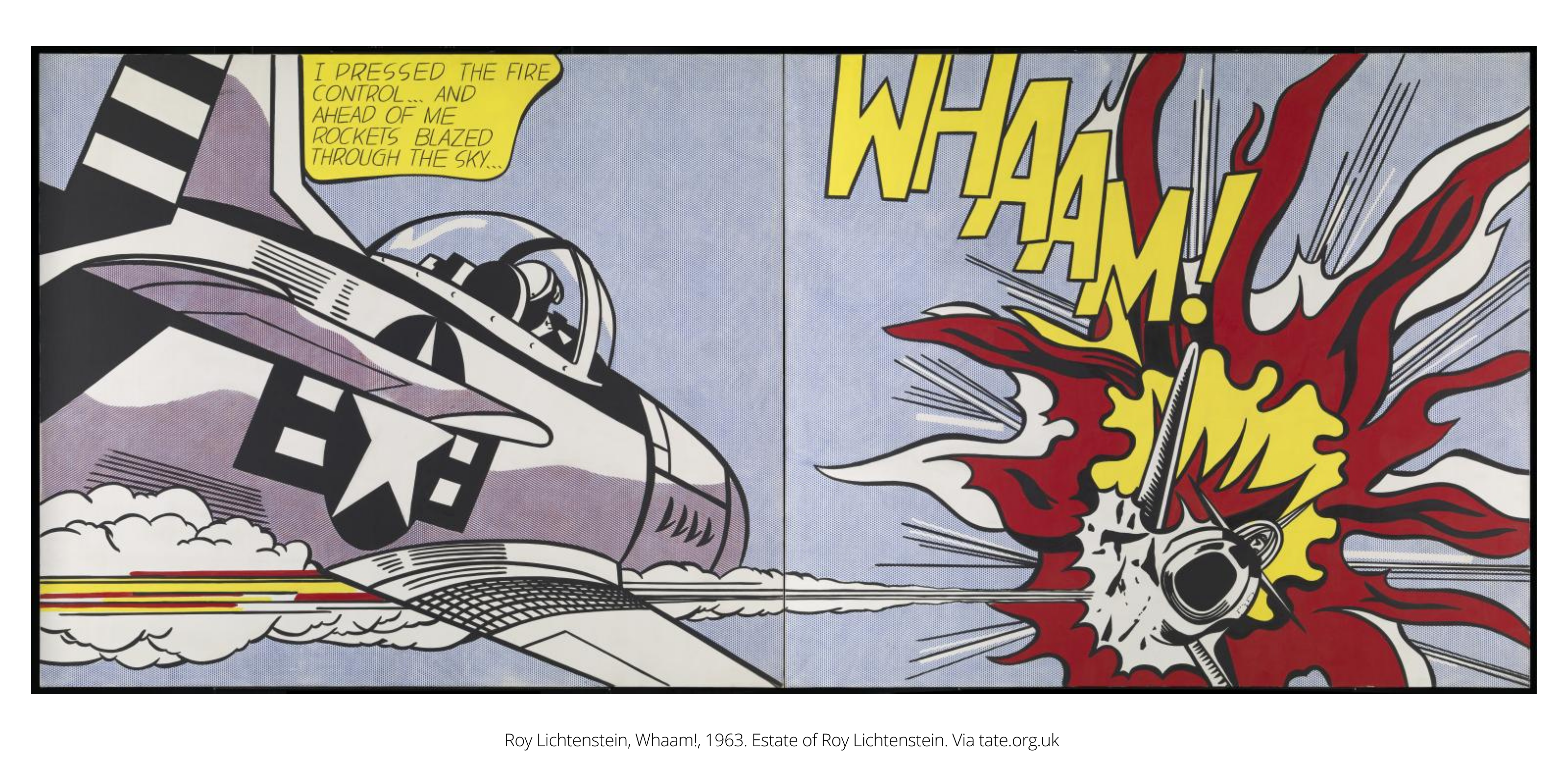
Another iconic artwork that combines war and pop culture is Roy Lichtenstein’s Whaam! (1963). Even though the composition was taken from a DC Comics All-American Men of War (issue 89), Lichtenstein divided the original piece into two canvases and used different colours that differed from how it appeared in the original comic book (for example the letters of ‘WHAAM’ are yellow instead of white) perhaps as a way of imposing his own perspective on the piece. Taking into consideration Lichtenstein’s own service in the US Army in 1943-6 and the fact that the piece was created during the escalation of the Vietnam War (1955-1975), perhaps Whaam! Is Lichtenstein’s way of exposing the contrast of what American cultures implies is only meant to be a ‘fantasy’ (that lives only in comic books), with the stark reality of what he and many other American men had experienced in their own direct ‘reality’ in their everyday lives. It could also be seen as a response to ongoing conflicts and a “statement on the folly of war”.
Andy Warhol is most famous for his takes on consumerism and pop culture so it’s no surprise he is affectionately named the ‘King of Pop’. His artworks depicting soup cans and portraits of Marilyn Monroe certainly shaped the iconic look of American Pop Art that we know and love today, but he also wasn’t afraid to delve into heavier topics and aesthetics, at the complete other end of the spectrum, such as death.
In his Death and Disaster series, Warhol took newspaper images of car crashes and suicides and explored the effect of image reproduction repeatedly across a canvas. He was testing his hypothesis that gruesome images lose their power to shock and affect us when they are seen over and over again.
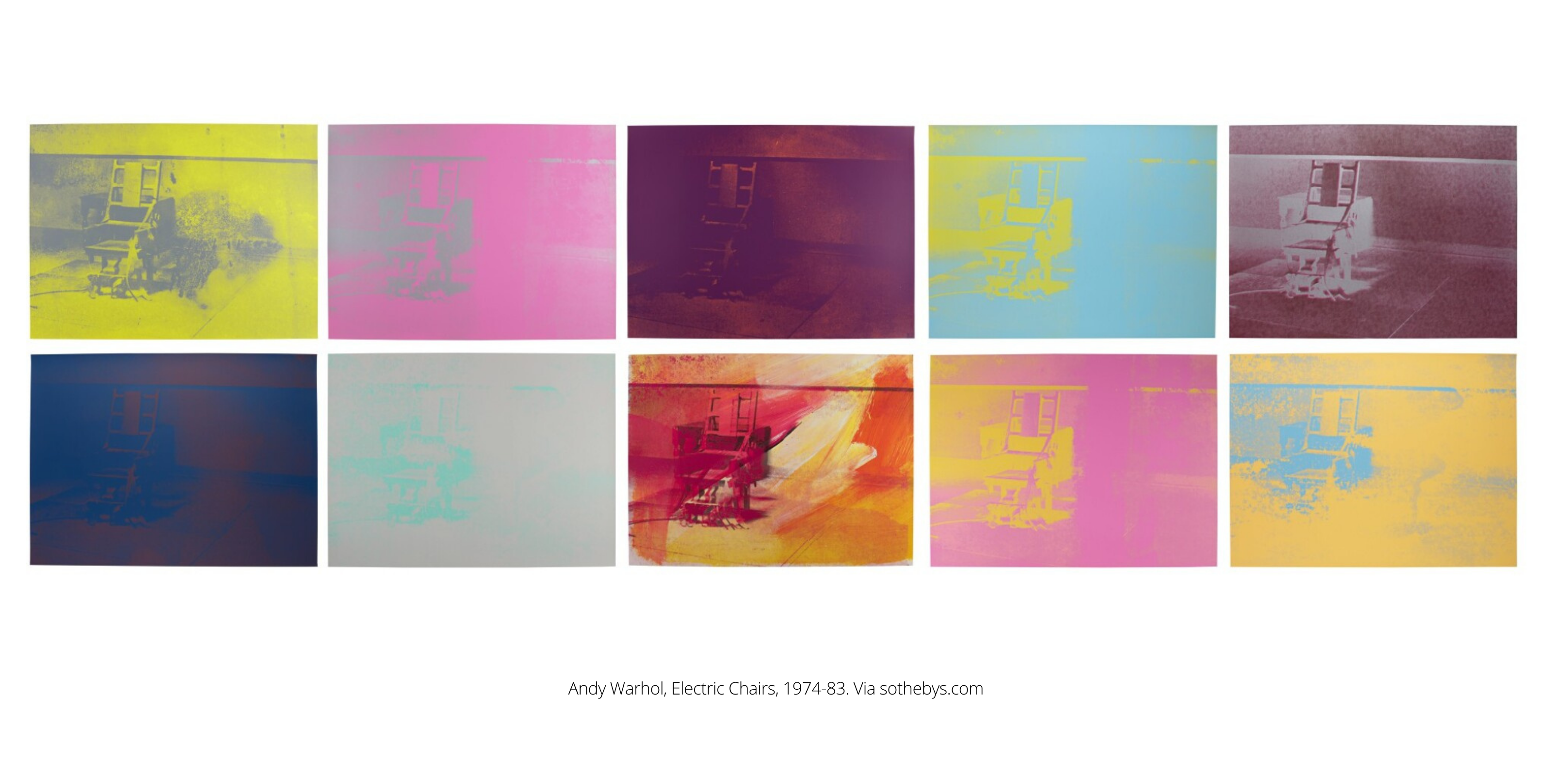
His Electric Chair (1964), which is a part of this Death and Disaster series, shows an unoccupied execution device in an eerie dark room. It was based on a press photograph from 1953 of the death chamber in ‘Sing Sing’ Prison in New York, where two American citizens were executed.
Later, in 1971 he then produced a series of ten screen prints of the Electric Chair in different colours to play with that same hypothesis and push it to the extreme. Warhol was fascinated by the fact that death has such a big part of our lives, but we often distance ourselves from it, and so he wanted to push us (unwillingly) into acceptance of it in this series. However, Electric Chair contrasted with the other images from the Death and Disaster series which were more literal, as actual human figures were the subjects of the work, as opposed to this more abstracted (and eerie) reference to them. The power of Electric Chair comes in the emptiness and void it portrays, along with how its repetition desensitises the viewer to the concept of death on an ‘abstract level’, going beyond the already explored ‘literal level’ of the previous works in the series. Therefore, Warhol makes us confront the fact that we quite literally cannot escape the concept.
Pop Art Over the Decades
In the 1970s, Pop Art gradually held less of the spotlight in the art world, as the focus began to move towards performance and installation art. It’s relevance was however revived in the 1980s, where it gained a new title to reflect its resurgence; ‘Neo-Pop’.
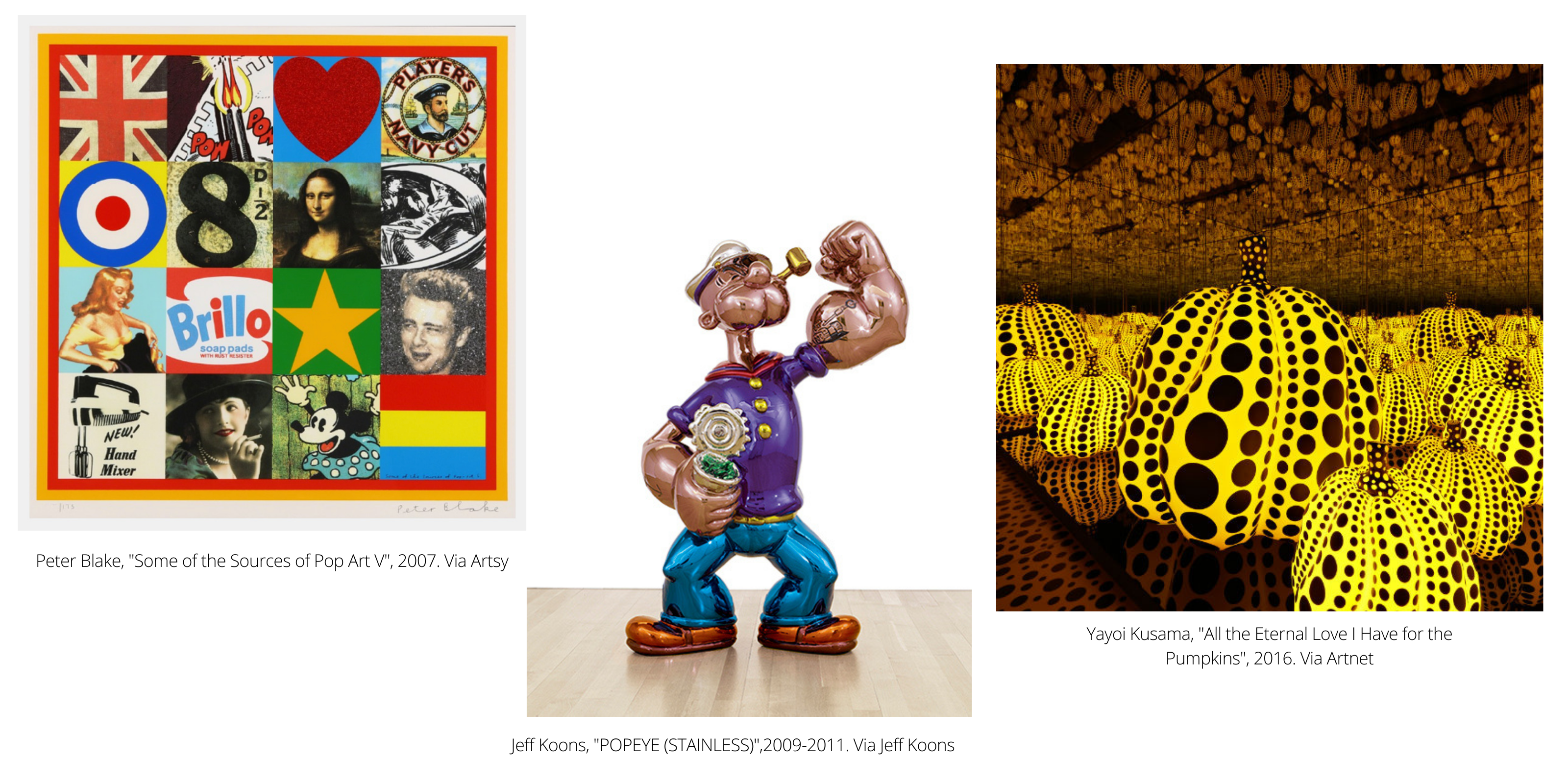
Even though the aesthetics of Pop Art today might feel like they have evolved quite a lot since the 1950s, the pop artists and the works of today seem to carry much of the same satirical and sarcastic views on society, mass-consumption and capitalism. In the next article of this series, Pop Art: Now: Hirst to Kusama, we will talk about what the movement looks like in our present day, and the most prominent artists that have shaped and continue to shape it.
